Skip to content
Copied to clipboard
All work
Case studyCybersecurity · National security

From government contractor to cyber guardian.

We rebuilt Pueo Business Solutions from the positioning up — turning an underpowered website into a pure-play cybersecurity presence built for the intelligence community.

Client
Pueo Business Solutions
Engagement
Positioning · Brand direction · Design system · Website
Platform
Next.js — fully custom build
Visit the live site
Overview

A brand that had outgrown its website.

Pueo protects and inspects some of the country's most sensitive networks. On paper, an elite cyber firm. On screen, a light, text-dense contractor site that looked like a small generalist shop — the value buried under credentials, the mission nowhere in the headline.

J Media Group led the reposition and rebuild end to end: the strategy, the competitive read, the visual direction, a full tactical design system, and the redesigned website — so Pueo now reads the way it operates.
Positioning strategyCompetitive benchmarkingBrand & visual directionDesign systemWeb design & build
pueo.com
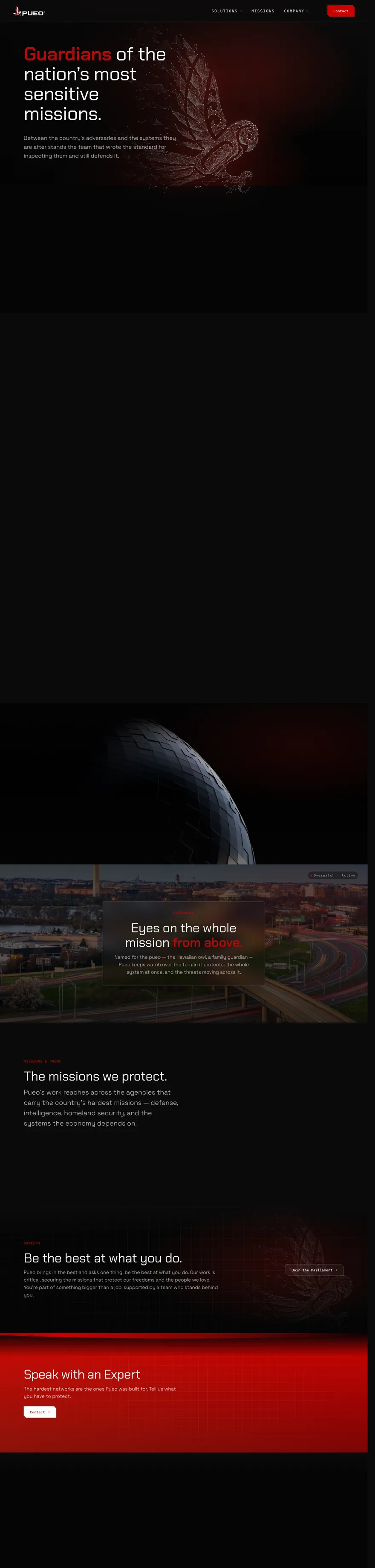
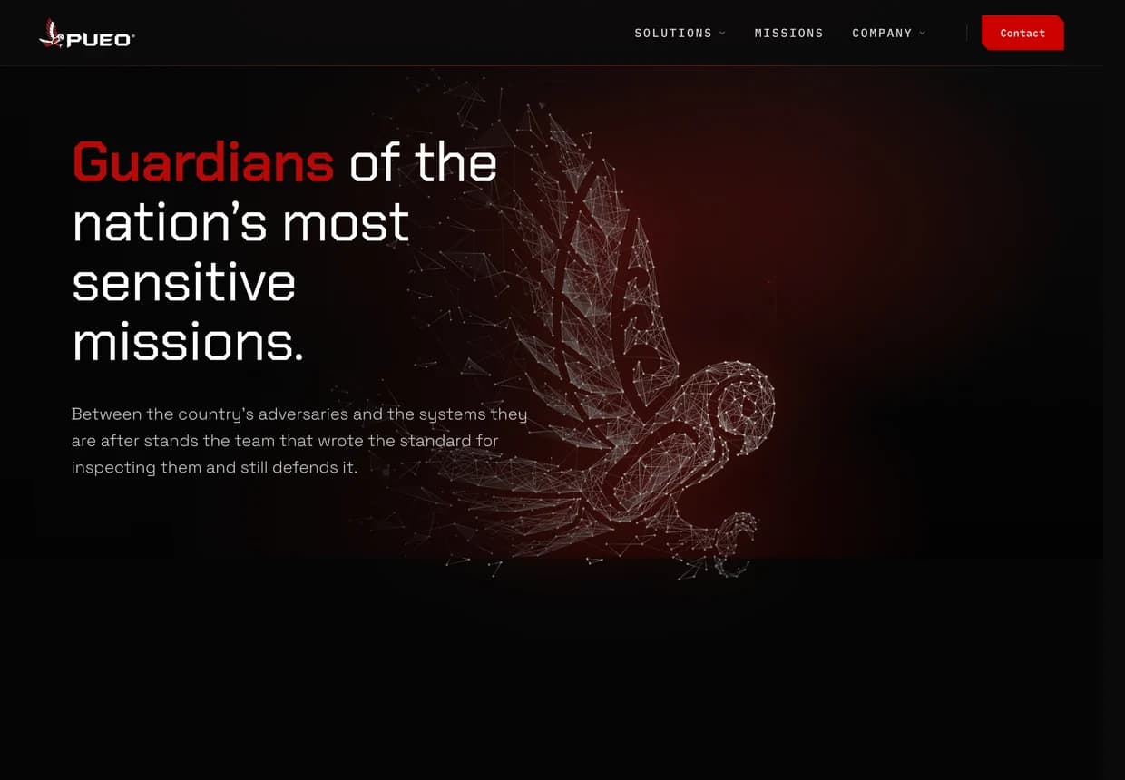
Redesigned Pueo homepage — dark, cinematic, “Guardians of the nation's most sensitive missions.”Original Pueo homepage — light, generic government-contractor layout.BeforeAfter
◂ Drag to compare ▸

The homepage, before and after. Drag the handle to reveal the redesign.

01 — The challenge

Elite firm. Generalist website.

The goal was clear: the site had to read as a large, elite, mature cybersecurity firm — not a small contractor with a long capabilities list.

The previous site led with heritage and history, framed the offer as generic “services,” and asked visitors to work through credentials before they reached the mission. A capable firm — presented like a smaller, generalist shop.

The strongest parts of the business were buried. There was no mission-first narrative, no clear path for high-clearance talent, and little sense of the scale the company operates at.

What the reposition had to fix
Buried valueMission and capability lost under credentials and heritage.
Generic postureRead as a generalist GovCon shop, not a pure-play cyber prime.
Wrong signalsA light, dated layout with no mission-first story.
No talent funnelNothing built to attract elite, cleared professionals.
02 — Strategy

The “Tactical Tech” pivot.

Rather than rebrand, we leaned into the brand Pueo already had — red and black — and pushed it into a Command & Control aesthetic that signals precision, scale, and mission-dominance.

Positioning pivot
Before
A generalist contractor offering “services”
After
A pure-play cyber company delivering “solutions”

Language did real work here. “Services” became Solutions. Feature lists gave way to an outcomes-first voice. And the required government Cyber Audit — the compliance gateway every contractor must clear — was reframed as the lead offering rather than fine print.

Benchmarked to lead — not to match
Immersive storytelling
Take the visitor into the mission
The category's best sites lead with narrative, not brochureware. The redesign answers with a cinematic, scroll-driven story that puts the mission first.
Technical credibility
Show the work, not just claims
In place of stock imagery, live, systems-driven visuals signal real engineering depth — proof, not decoration.
Prime-contractor scale
Read as a large, serious firm
A disciplined grid and confident type project the scale and gravitas of an established prime.

We studied the category's most respected players and designed to one standard: match their strengths, then take the lane none of them owned — a modern, command-and-control edge that still reads mature.

03 — The work

The transformation, page by page.

Every core page was rebuilt around the mission. Drag each slider to move between the old site and the redesign.
pueo.com/solutions
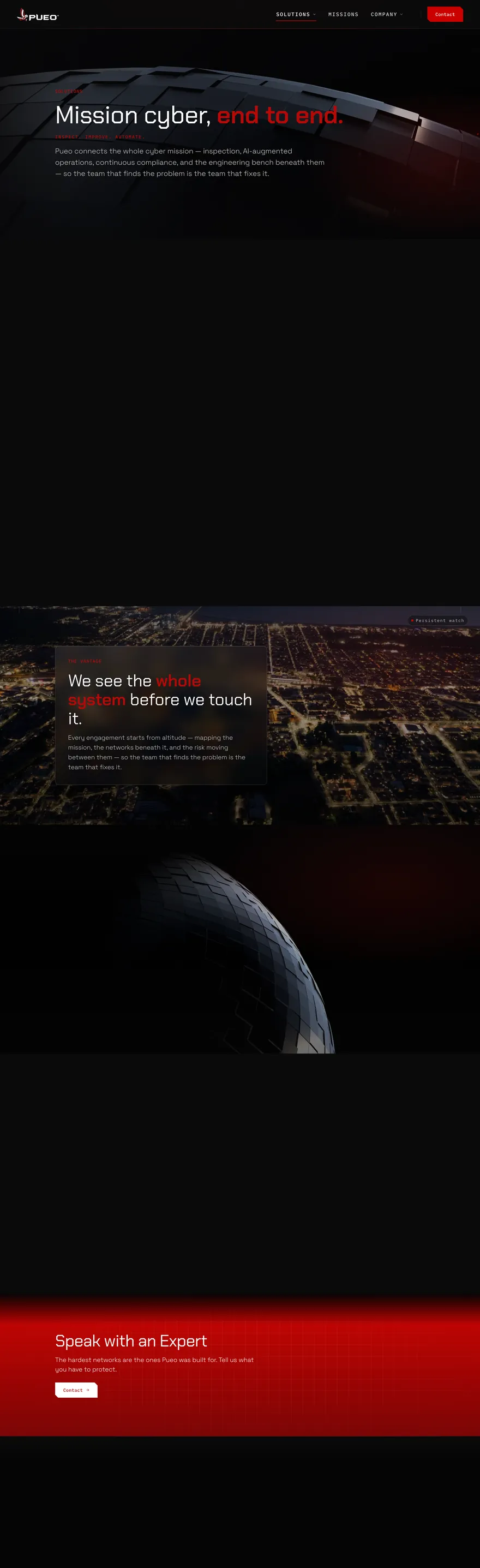
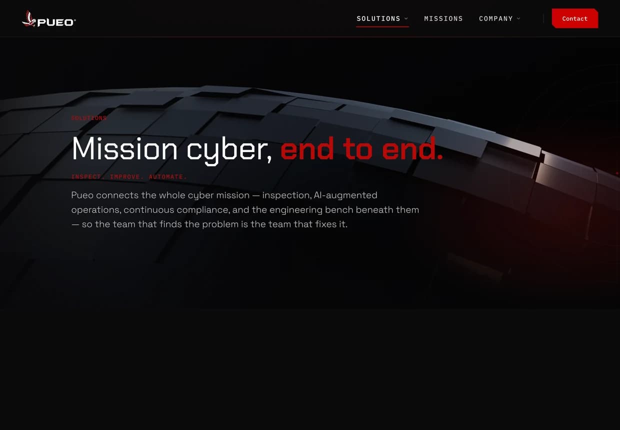
Redesigned Solutions page — “Mission cyber, end to end.”Original Services page — dense capability lists.BeforeAfter
◂ Drag ▸
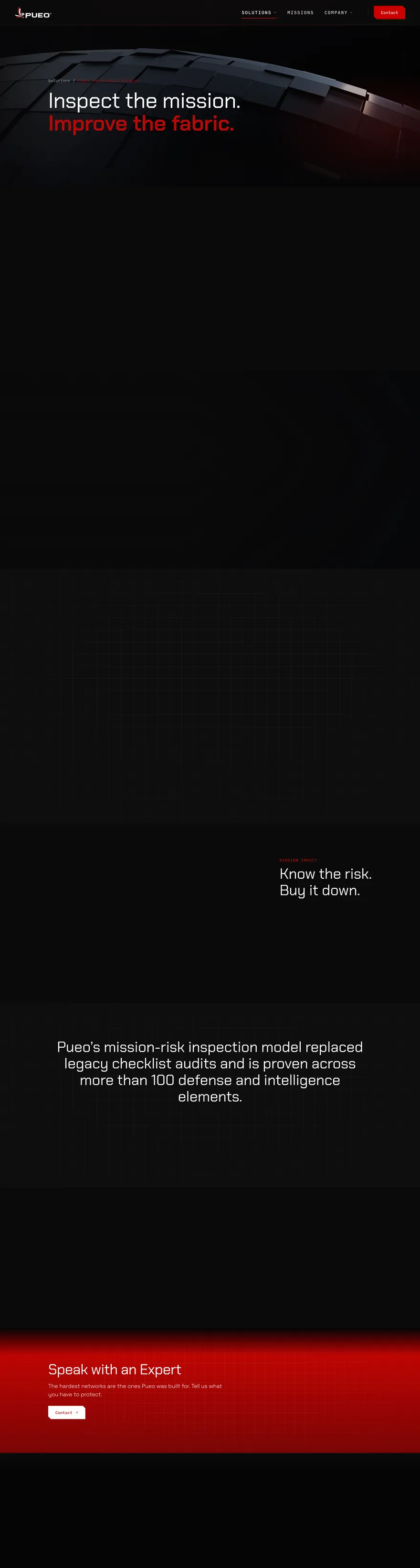
Services → SolutionsA wall of capability bullets becomes a cinematic, outcomes-first story: “Mission cyber, end to end.” The team that finds the problem is the team that fixes it.
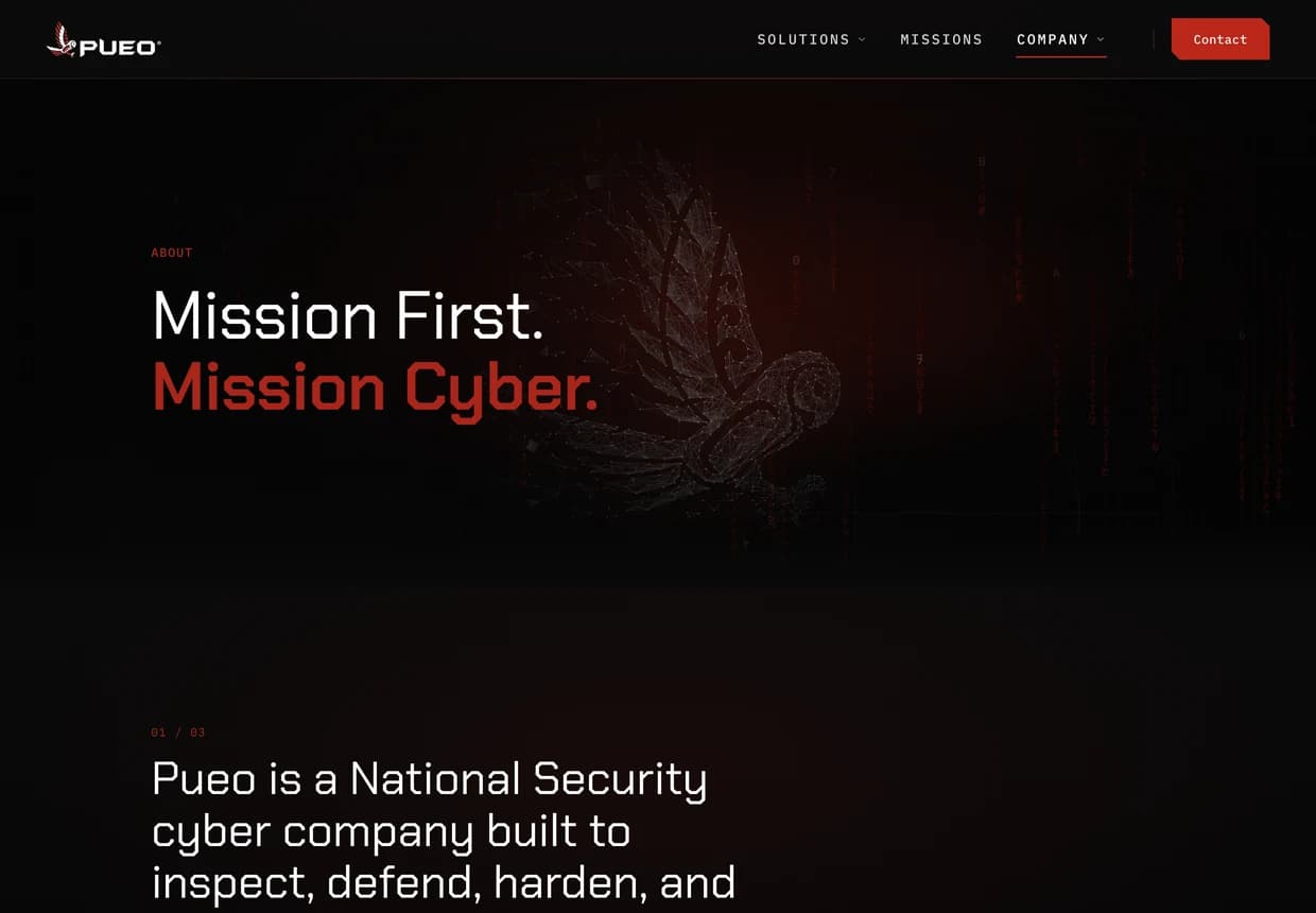
pueo.com/about
Redesigned About page — “Mission First. Mission Cyber.”Original About page — “What is Pueo?” heritage story.BeforeAfter
◂ Drag ▸
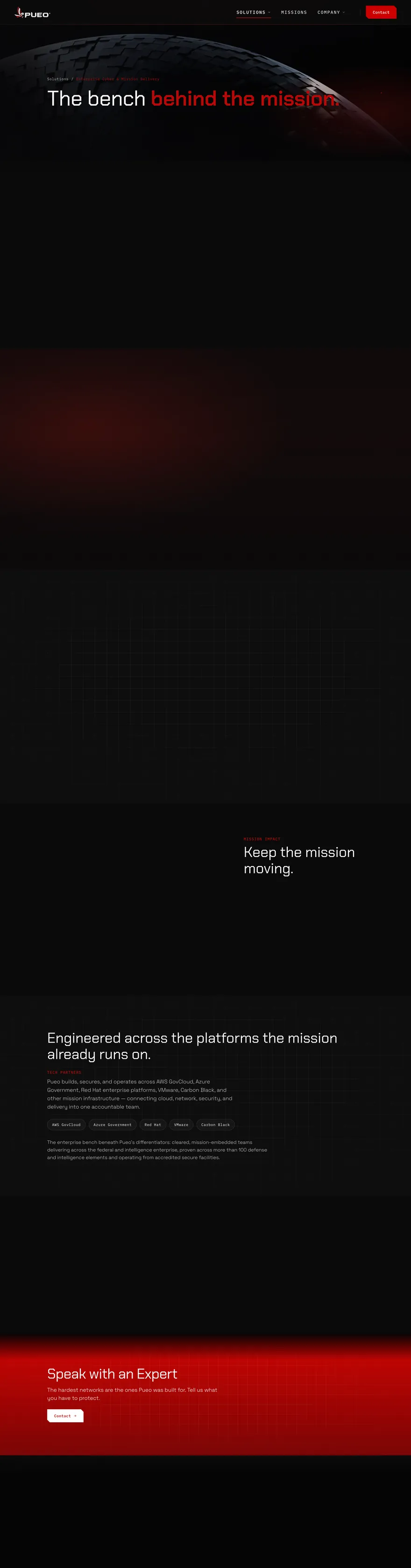
Heritage → MissionThe owl story stays — the pueo is a family guardian — but the page now leads with the mission. Heritage is honored with restraint, never worn as costume.
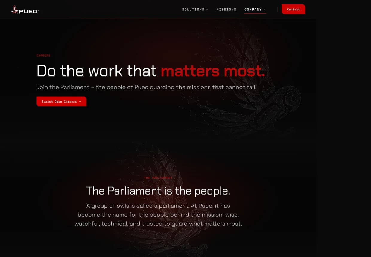
pueo.com/careers
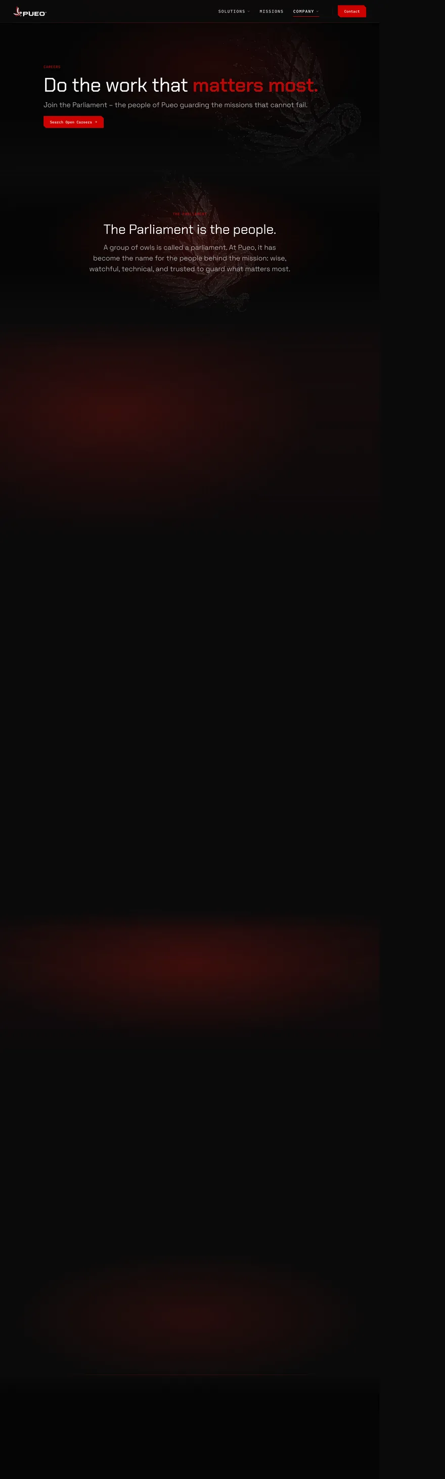
Redesigned Careers page — “Do the work that matters most.”Original Careers page — “Joining the Parliament” culture page.BeforeAfter
◂ Drag ▸
Recruitment, elevated“Join the Parliament” — a group of owls — is kept and sharpened into an elite call for cleared talent: do the work that matters most, guarding the missions that cannot fail.
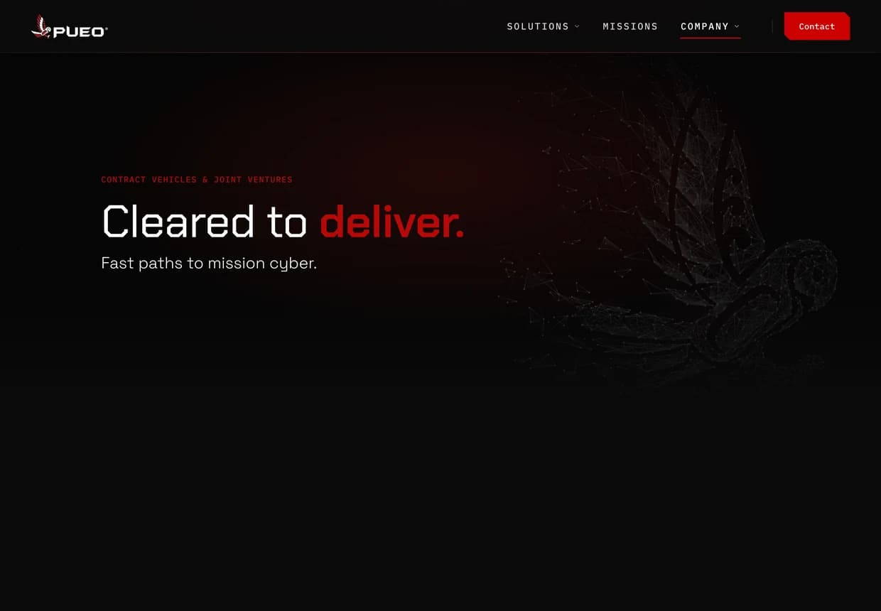
pueo.com/contract-vehicles
Redesigned Contract Vehicles page — “Cleared to deliver.”Original GSA STARS III contracts page — plain document layout.BeforeAfter
◂ Drag ▸
Contract vehicles → “Cleared to deliver”A plain GSA document page becomes a confident, fast-path statement: cleared to deliver, fast paths to mission cyber.
04 — Design system

A tactical system, not a one-off page.

Under the redesign sits a documented design system — tokens, type, a tactical button language, and mission motifs — so every future page stays unmistakably Pueo.

Pueo · Tactical Tech system

Palette — dark base, one signal red

Midnight base
Deep red
Signal red

A near-black base with a single, disciplined signal red — carrying fills, status, and accent alike. Gradients stay in the black-to-red family; no white in the big backgrounds.

Type — Inter + JetBrains Mono

Mission cyber, end to end.
▸ Coordinate label · System armed
Weight contrast — not serifs, not italics — carries the hierarchy. Mono is reserved for labels, coordinates, and status readouts.

Tactical button system

Initiate Audit ▸Learn more

A purpose-built action language — angular, tactical primary buttons with a live status cue, and framed secondary buttons. A signal system, not a generic pill.

Mission motifs

Radar
Node grid
HUD lock
Brand strip
Foundation
A near-black base with a saturated signal red — real depth and layering, never flat.
Surfaces
Liquid-glass hero surfaces with genuine depth and a living brand accent.
Navigation
Radar, HUD brackets, and coordinate cues — a “systems activated” signal language.
Discipline
One owl only — the brand's own mark. Heritage is honored with restraint, never worn as costume.
Voice
Outcomes-first, tactical verbs — orchestrate, harden, safeguard. Sentence case, no hedging.
Engineering
A fully custom Next.js build — component-driven, fast, and owned outright, not rented from a page builder.
06 — Outcome

What changed.

Not just a better-looking site — a presence that finally matches how the company operates.

Repositioned as pure-play cyber

The site now leads with the mission and reads as an elite, mature prime — not a generalist contractor. Solutions, not services.

A mission-first architecture

Solutions, Missions, Leadership and Contract Vehicles replace a flat menu — and a Cyber Audit gateway makes the required-first step impossible to miss.

Built to recruit

“Join the Parliament” turns careers into an elite call for cleared talent — a funnel the old site simply didn't have.

A system that scales

A custom Next.js build with a documented design system means every future page — Innovations, Labs, new solutions — ships fast and stays on-brand.

Related GovCon work

Next case

WashingtonExec

GovCon

Ready to get started?

Have a brand that's outgrown its website?

We do strategy, brand, and build — the whole reposition, like we did for Pueo. Tell us what you're protecting, selling, or scaling, and we'll scope it.